M Y R O L E
Mobile UX Designer
D E L I V E R A B L E S
Site audit (desktop app)
Competitive analysis
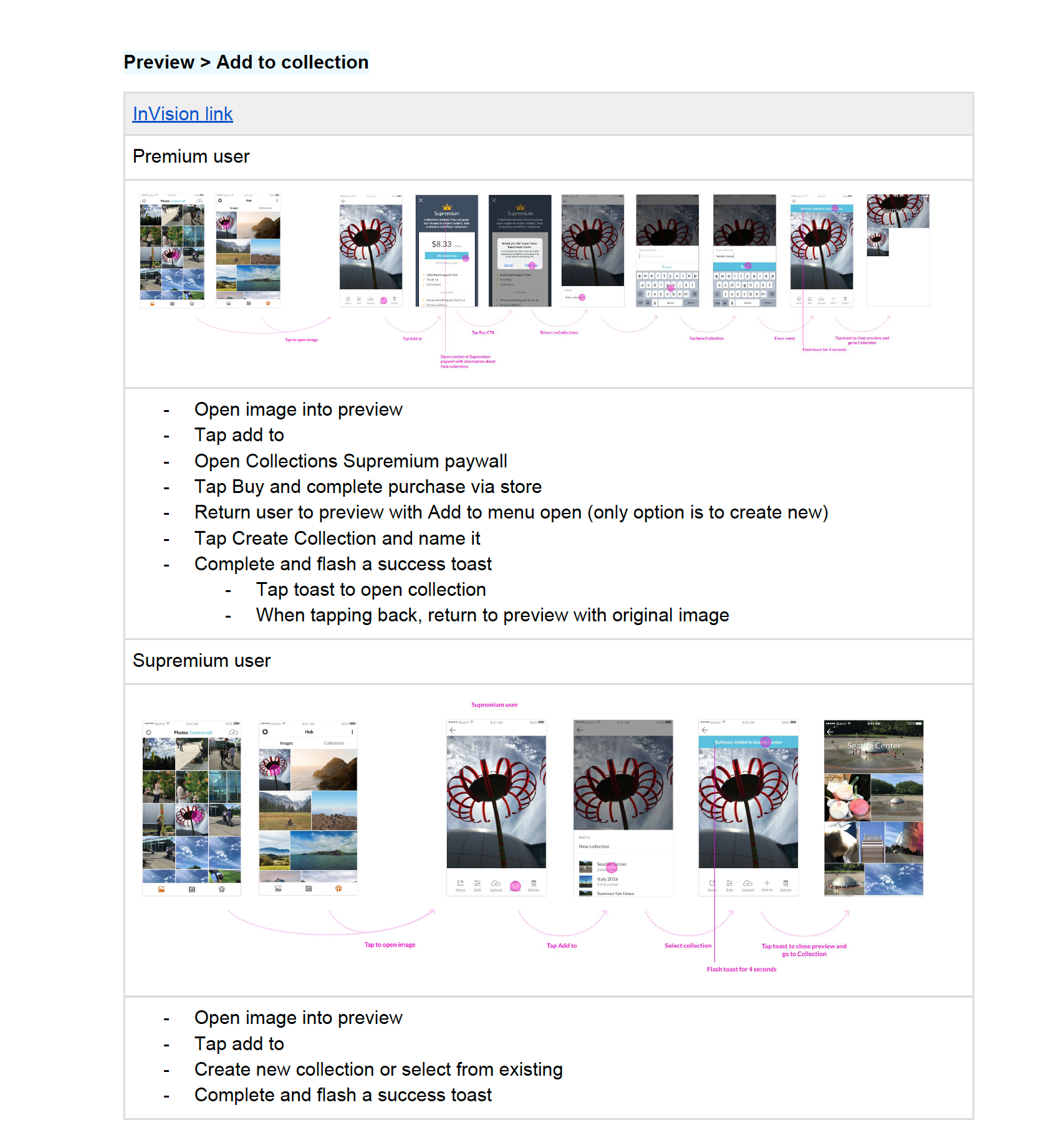
Prototypes
UI guidelines (new elements)
User study reports
Competitive analysis
Prototypes
UI guidelines (new elements)
User study reports
B A C K G R O U N D
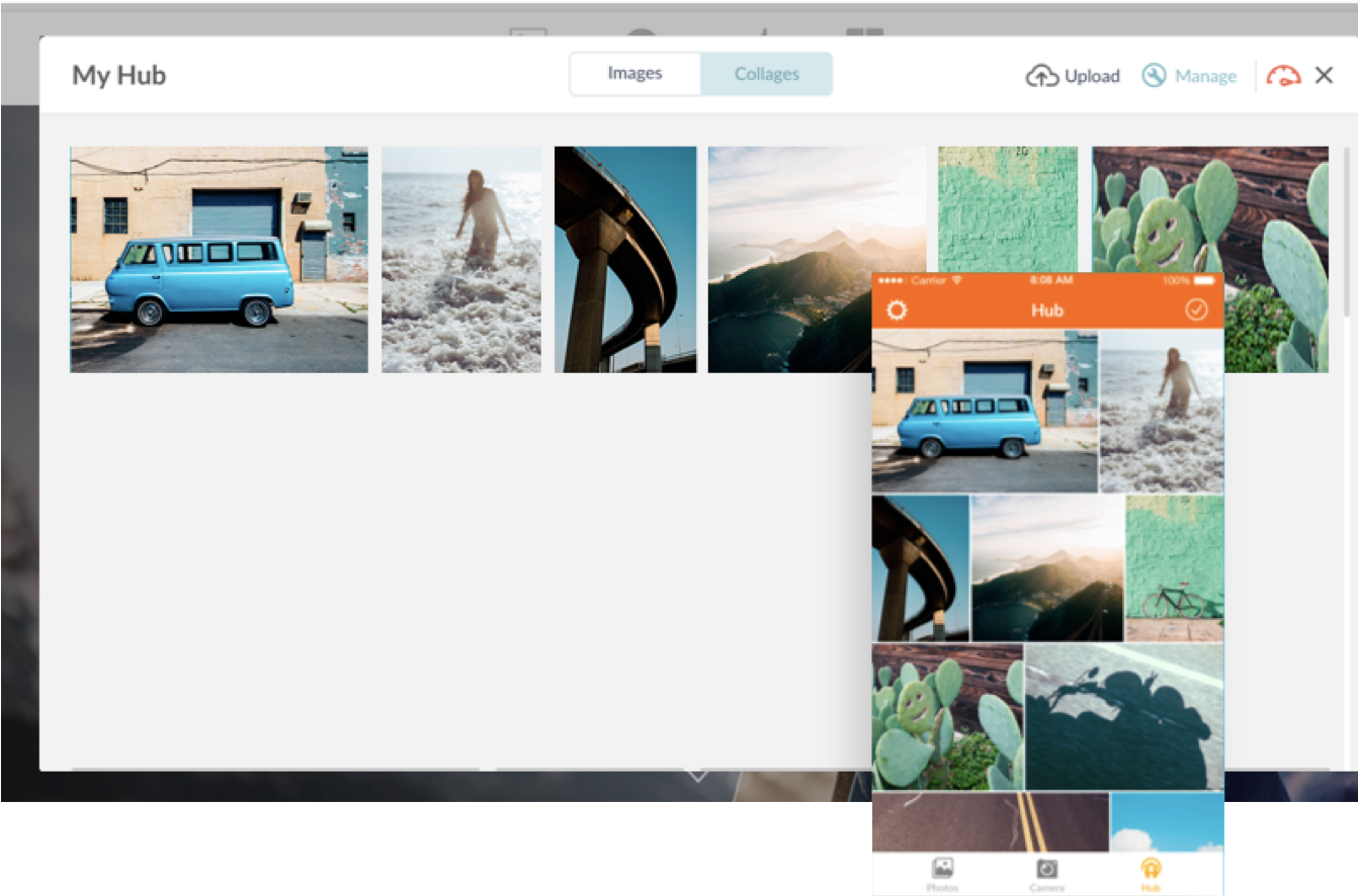
PicMonkey is a web based photo editor; it's easy to use like instagram but robust like photoshop.
The creation of the mobile app was a bit of a delayed start so we were still in the process of playing catch up with our competitors. We were moving fast, looking for feasible opportunities that would help grow and add value to the app. One of the ways we were focused on doing this was by building parody between the desktop and mobile app.
C H A L L E N G E
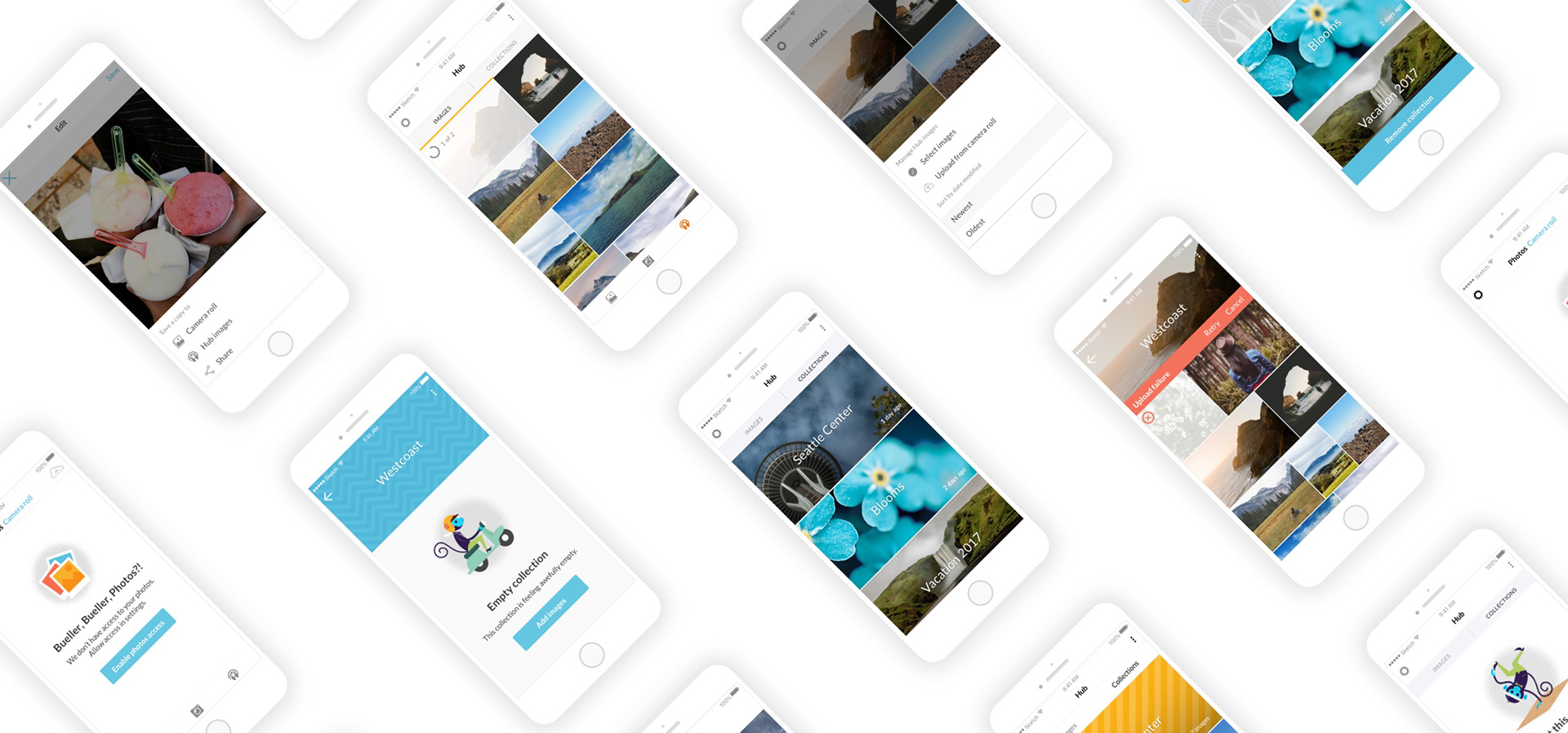
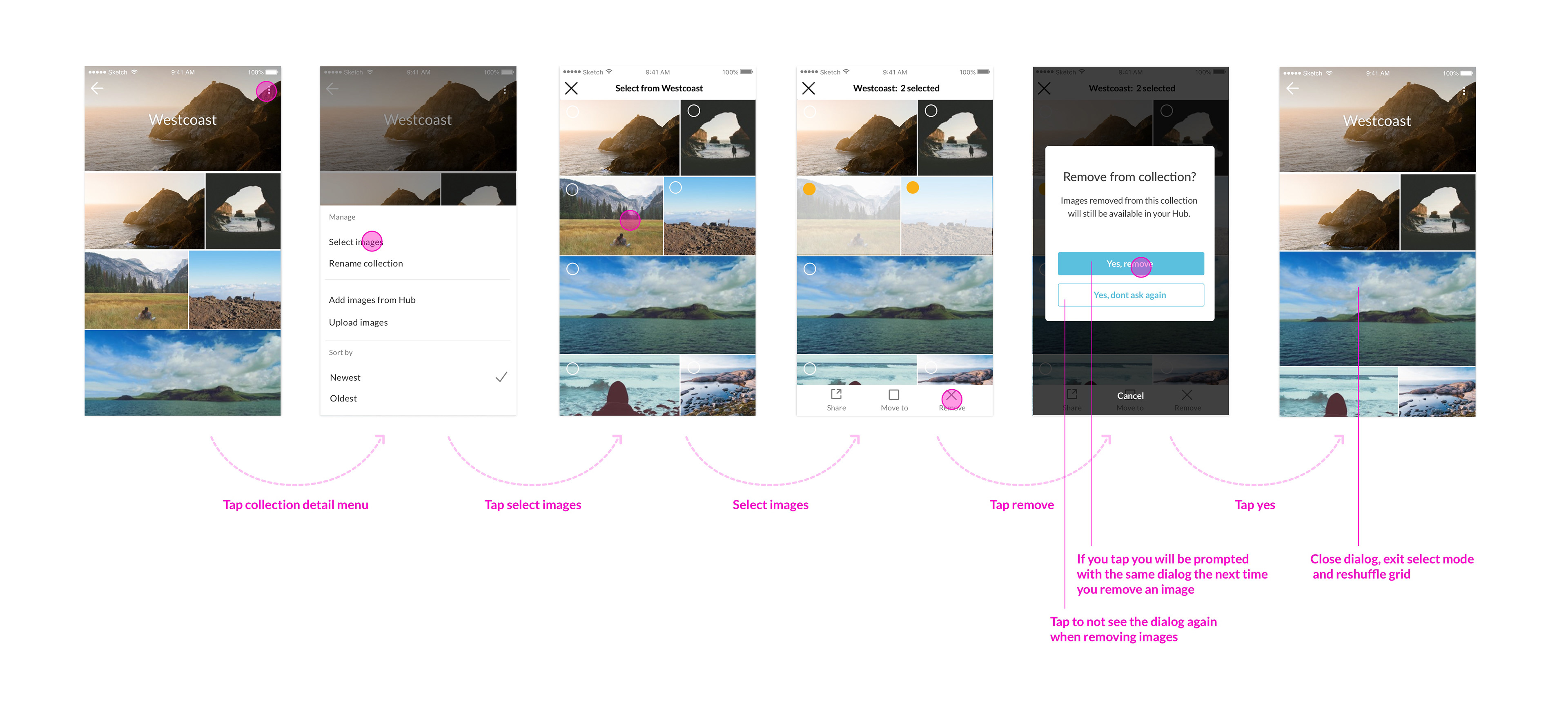
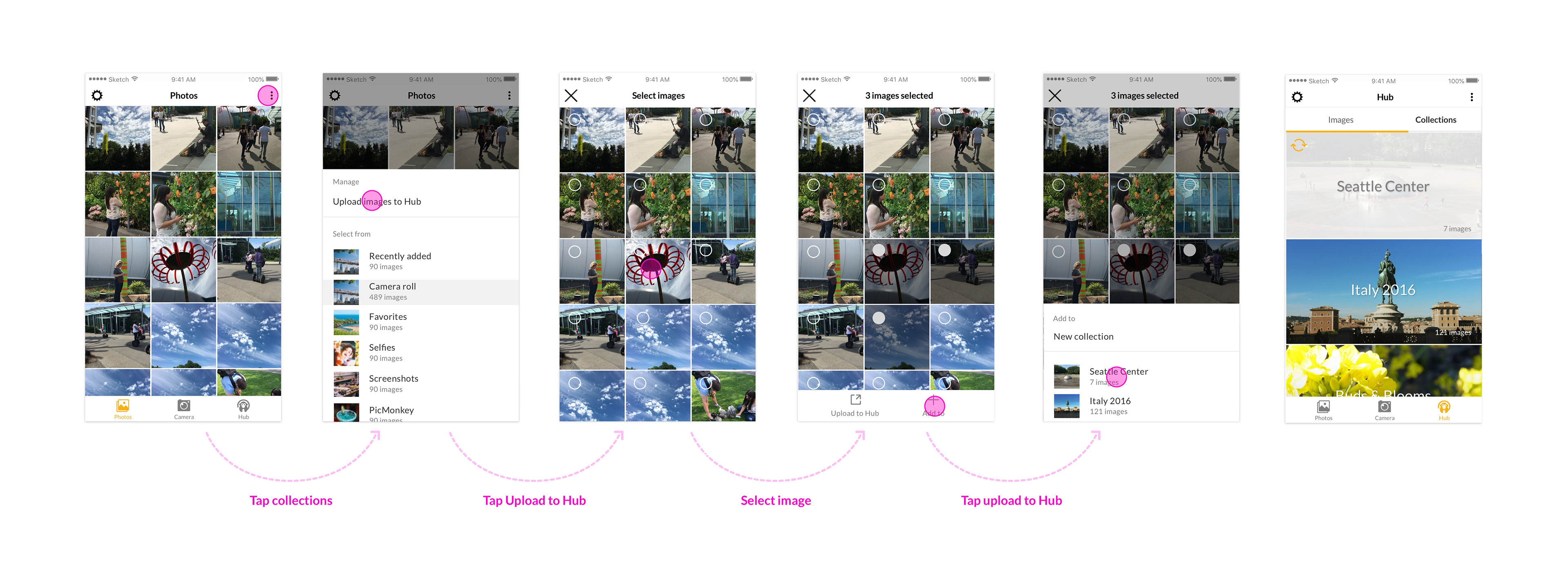
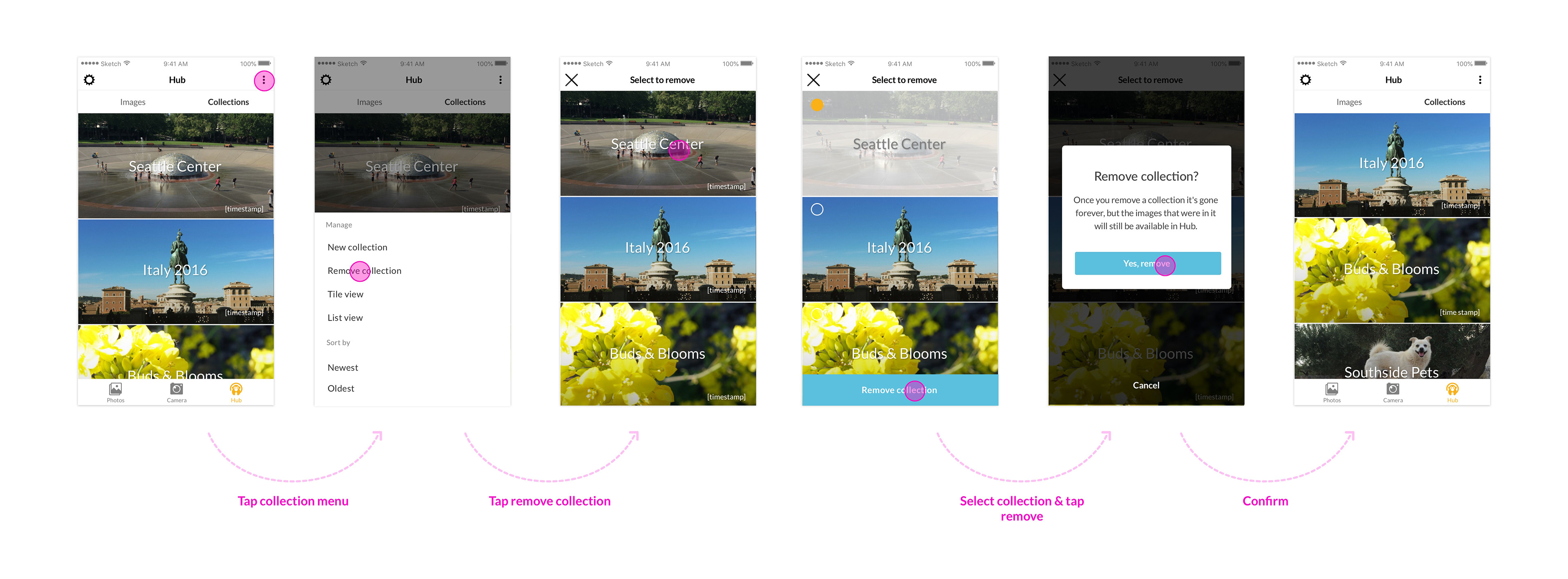
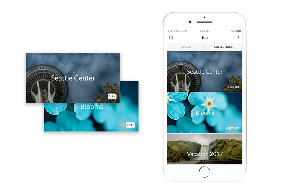
Bring"Collections" to the mobile app
With the addition of this new feature we hope to:
• Build a more unified experience between desktop and mobile app
• Add more value to the app (with the goal of boosting subscriptions)
• Give users a one-stop location to access and organize their work
• Add more value to the app (with the goal of boosting subscriptions)
• Give users a one-stop location to access and organize their work

Discovery
Because this feature already existed on desktop, we needed to work closely with the desktop team to ensure we were informed on the ins and outs of this feature as well as keeping them informed of our findings and progress.
• Competitive analysis
• Desktop feature audit
• Establishing guardrails and constraints
• Desktop feature audit
• Establishing guardrails and constraints
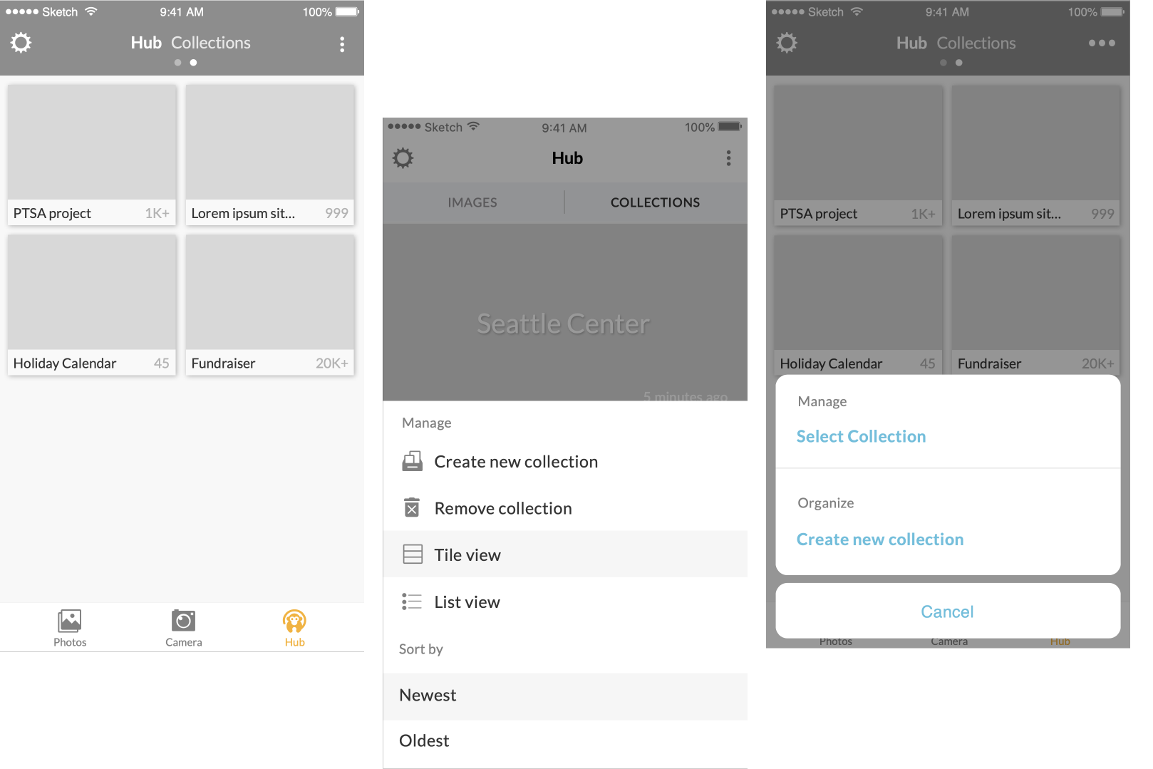
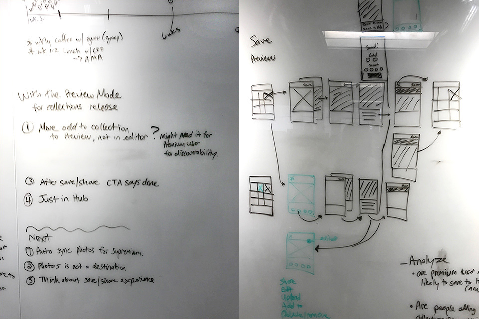
E X P L O R A T I O N
Uncover edge cases and awkward UX: Mapping user flows
Uncover edge cases and awkward UX: Mapping user flows
• We discovered the need for "preview mode"
Delete image from preview mode
Entering editor from preview mode
E X P L OR A T I O N
Animation
To build out our animation requirements the mobile lead and myself used Principle to better illustrate how these interactions would look and feel.
V A L I D A T E
Moderated study
🎯 Goal
Validate our design decisions and gain more clarity on areas in question
👩💻 Users
6 PicMonkey .com users
6 Team members
👩💻 Users
6 PicMonkey .com users
6 Team members
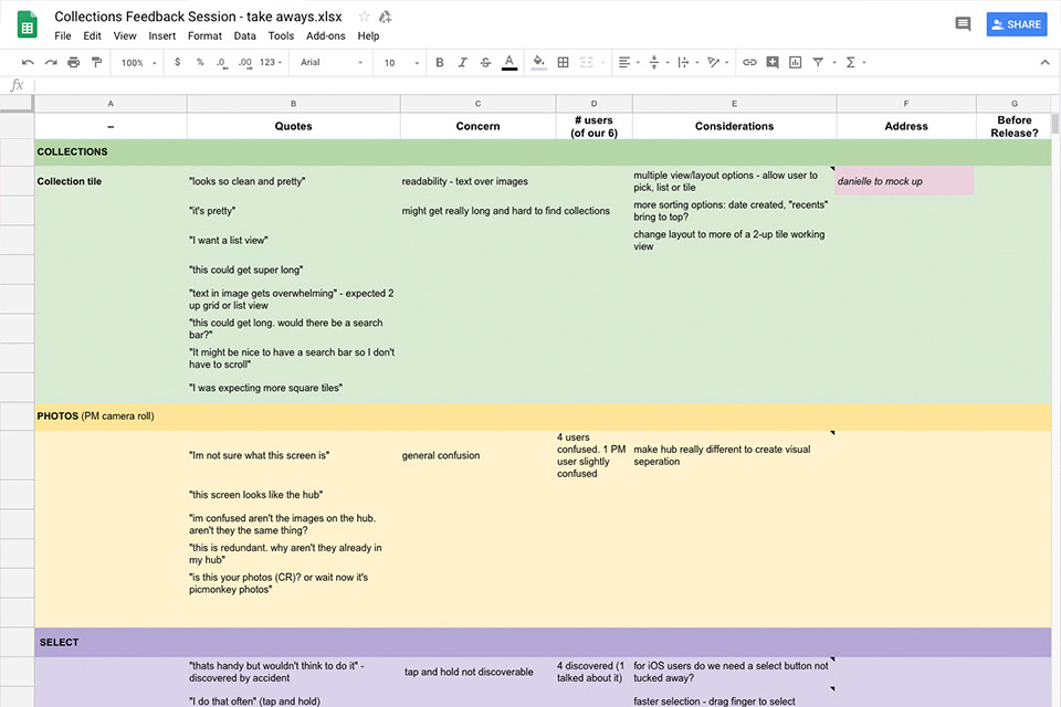

"The number tells me there's a limit on how many photos I can have"
This feedback was so valuable to us because one of our goals was to encourage users to create more and take advantage of the limitless storage we offered.
"It feels like I'd have to scroll forever to find anything"
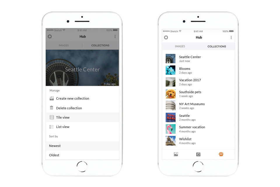
Participants enjoyed the look of large tiles but when asked to find a particular collection the treatment wasn't as well received.
We needed to provide a faster way for users to look through their collections.
F I N A L I Z E
Release requirements and specifications
Before moving into development we gather all feature details. The work is broken into digestible chunks, with corresponding tickets, agreed upon with our dev partners PM and QA lead. Additional sources for build out:
• Final designs in Sketch and Zeplin
• Flows in InVision
• Feature stories outlined in Jira
• Flows in InVision
• Feature stories outlined in Jira